
Monday 19 September 2011
Sunday 18 September 2011
4: developing advert campaign & planning for pitch. Part A
DIGGIT!
Location: tower ramparts & Wetherspoons
Time of day: night/early evening
Characters: 3 guys, a bouncer, and a girl
Target Audience: 14-18 year old boys
Advert
The 3 lads are waiting to get into the club, when they get to the door they’re refused entry by a bouncer. They all decide to go home; two leave whilst one goes to the bus stop across the road. After looking at what time the bus comes he goes to get a drink from the machine outside the shopping centre.
The boy gets his drink and after drinking it he needs to go to the toilet so goes round the corner. When he comes back we see he has changed and is now much older looking. Deciding to try his luck at the club again, he gets back in the queue this time he goes right on in.
Fade to black.
We see the boy looking worst for wear in bed, when he turns over we notice that he is not alone with the back of a girls head clearly visible. The boy goes back to sleep with a massive grin on his face.
We then go to a clear shot of the drink on his bed stand, with the two in bed out of focus in the background.
 Product
- Tall and slim aluminium can e.g. red bull can
- Logo
- Font: Mistral
Colour: dark brown and light orangey brown.
Background colour: black
- Energy drink
- slogan:
X-CO
Location: Skate Park
Time of day: afternoon
Characters: El Hombre, and 4 boys
Target Audience: 14-18 year old boys
Advert
A group of guys are trying to do tricks on skateboards but are failing miserably; one guy is doing so bad he stacks and falls right on his face.
Embarrassed he gets up to leave, just as he is reaching for his skateboard it is handed to him by a mysterious stranger with leather glove on. The stranger skates off and starts doing all these tricks much to the amazement of everyone else who has stopped skating and turned to watch the mysterious guy. As El Hombre does all of his tricks it freezes on him and it animates the image of his freeze before unfreezing and seeing him do the next trick. El Hombre eventually stops and skates back to where the guy was standing then hands him an X-Co drink before skating off.
We see the guy open the bottle then it flashes to a shot of him actually doing a trick which then freezes and the bottle comes on screen with the slogan X-Co: Its a shockwave to your brain.
 Product
- 500ml aluminium can
- Logo
- Font: Scrapped Knee
- Colour: dark blue on a white background
- Colour: dark blue on a white background
- Energy drink
- X-CO: its a shockwave to the brain
Other
Potential song: Noots by Sum 41
Potential song: Noots by Sum 41
3: primary research 2. Part B
Interviews
Following the questionnaire i then carried out a few 1-1- interviews with 2 more guys and then 2 parents. This was so i could get feed back on my ideas and whether or not the parents found it to be appropriate; as sometimes because of complaints from parents certain adverts get shown after the watershed.
The guys
Felt the idea of trying to get into a nightclub was appropriate age group wise and suggested that perhaps I include a female in the ad. Where as they found the ad which showed the better skater to be a girl, with her giving the guys the drink which made them better, “unbelievable”.
Whilst the comments were rather sexist they did have a point audience wise, as it seemed I was trying to make it the opposite of a Yorkie Bar advert “It’s not for girls!”
The parents
I told them about my advert in which a old man is telling his grandchildren about the Aesop fable The turtle & The Hare; in which the two characters are drinking different energy drinks the turtles being a better one which gave him the energy to win.
Despite giving good feedback about how it’s a secret twist in an old story, I felt that the ad was starting to become aimed at a younger audience. So I shelved the idea.
I also talked to them about the nightclub advert which wasn’t met with negative views as I expected the two reminiscing about trying to sneak into places when they were younger. The dad said if only he had that drink he wouldn’t have spent many a night at home on his tod. The mother said as long as you don’t go too into it about partying and getting girls it should be safe and remain kind of cheeky.
3: primary research 2. Part A
Questionnaire
1) How old are you?
2) What is your gender?
Female Male
3) What do you think makes an advert memorable?
Characters The music The product Other
4) Would you rather watch an animated advert or one with real people in?
Animated Real people
5) What catches your attention in an advert?
Facts and figures Funny Images Logo Music
6) Do you think you’re more likely to remember and advert if it has a catchy jingle?
Yes No
7) Does it matter if the advert doesn’t relate to the product? e.g. Cadbury’s Gorilla.
Yes No
Why?
8) If the advert is good, are you likely to buy or develop a liking or greater liking for the product?
Yes No
If you answered no, why not?
9) What do you think is the most important part of selling a product?
The slogan The logo The advert The product
10) Would you still watch an advert if it wasn’t aimed at you?
Yes No
11) What do you think makes a bad advert?
12) What do you think makes a good advert?
Results
I asked 5 boys between the ages of 14 to 18 to answer the above questionnaire, here are the results:
3) What do you think makes an advert memorable?
Characters: 3 The music: 2
4) Would you rather watch an animated advert or one with real people in?
Animated: 2 Real people: 3
5) What catches your attention in an advert?(pick 2)
Funny: 5 Images: 3 Music: 2
6) Do you think you’re more likely to remember and advert if it has a catchy jingle?
Yes: 5
7) Does it matter if the advert doesn’t relate to the product? E.g. Cadbury’s Gorilla.
Yes: 3 No: 2
Why?
Y: all answers referred to not knowing what the product was
N: the brand is already big enough; people aren’t stupid they can remember things
8) If the advert is good, are you likely to buy or develop a liking or greater liking for the product?
Yes: 4 No: 1
If you answered no, why not?
I don’t like marmite; I don’t care how good the advert is I’m still not eating it.
9) What do you think is the most important part of selling a product?
The advert: 4 The product: 1
10) Would you still watch an advert if it wasn’t aimed at you?
Yes: 5
11) What do you think makes a bad advert?
Doesn’t make sense; isn’t funny; lots of talking; when they try to hard; when they dub the voices
12) What do you think makes a good advert?
Celebrity endorsement; action; characters with catchphrases; good vs. Evil when the good guy wins; babes
2: Primary Research 1. Part B
Vimto
"Seriously mixed up fruits"
Replacing Shlurple the Purple in 2009, Vimto’s recent campaign features the anthropomorphised ingredients of the popular fruit soft drink engaging in various activities; which sees them ultimately becoming splattered together to make the drink.
Vimto Lowrider advert 2011
“The new Vimto advert, featuring the track Bounce 'n' Boom by Box Bottom, shows Raspberry and his catch phrase Hello Pretty Ladies, Grape and Blackcurrant in LA bouncing themselves to destruction in a Lowrider car whilst impressing three hot LA chicks.”
In the advert Vimto mixes real life with animation as the characters Raspberry, Grape and Blackcurrant although present in the finished advert; were not filmed alongside the 3 ladies. The new characters created by Oscar-winning production company Passion Pictures (the team behind the animations for hit band Gorillaz) bring the two genres of animation and comedy together with what can only be seen as their idea of pulling girls. This includes a low-rider that wouldn’t be out of place in a cheesy rap video, or comedy film. In the ad we see the car move up and down because of a switch and button that blackcurrant touches; however as the characters are not real and were made in a studio, the car was instead operated by a remote control. So when the car was given that final jolt to ensure the guys got splashed together the girls were instead covered in a concoction of corn syrup and Vimto; rather than the main fruit ingredients of the drink.
Without being told that its been shot in America its very clear from the mise-en-scene, what with the tree’s, the road markings, houses and traffic lights to the low rider car and those Valley Girls it is clear as day Vimto is not in the homeland. Deciding to shoot in America is not at all patriotic but it does help to expand their market which I believe is where the producers were going with this. Despite not being on home turf the accompanying track Bounce ‘n’ Boom is by Manchester Dj Box Bottom; a not relatively known song til Vimto used it in the ad which has now had top 40 chart success.
What makes the advert more appealing is the fruit, by using the actual ingredients of the product to market it; it keeps in line with what the brand is, thus strengthening it. Vimto are taking the next step by letting the fruit become characters and have their own personalities as it makes them memorable. Who hasn’t watched the advert and immediately attempted a Russian accent just to say Hello Pretty Ladies. Its clear from the ad that Raspberry fancies himself as a bit of a ladies man, leaning out his window to talk to the girls and giving them the thumbs up you get the feeling he is the alpha male; saying that he is the more prominent character, being the only one to talk. Although all 3 seem to be up for impressing the ladies; as blackcurrant is the one to flick the switch activating the cars movement, before finally pushing the red button causing them to get splattered together.
The ad aimed at teenagers is ideal with the whole idea of trying to impress the girl, also without even having to mention or gesticulate towards it is for plain folk; as Vimto is such an institute to the nation who knows you can have it hot or cold as well as a fizzy drink. The ad serves it purpose at targeting teens but also getting that laugh out of the parents, and then the interest of a small child with its animation.
2: Primary Research. Part A
Pepsi Max
"Don't just live life...MAX it!"
Pepsi Max has launched a new series of ads that celebrates guys spending quality time with their mates. The new ads follow previous campaigns where the three Pepsi MAX mates' escapades saw them helping their buddies bag the job and get the girl. The latest instalment demonstrates the lengths they will go to, to overcome daily complications that threaten quality mate’s time.
Pepsi Max Burnout advert 2011
“The infamous MAX mates are back!”
The 2011 Burnout advert for Pepsi Max is about 3 guys who fool their boss into thinking he is hallucinating due to being tired after telling them they need to work late. The result? After seeing the cleaner upside down, a parrot, and then two of the guys with a clown's face and a horse's head their boss decides the work can wait til tomorrow. With their plan a success, cue dancing and a Pepsi max for all.
From previous adverts we have picked up on the bromance these 3 guys share, obviously the best of mates helping each other out to get the girl, get the job; and now to get out of those tricky situations. In this advert we learn a bit more about the guys, the factor that they aren’t just work colleagues but they actually work together could be how they became such good friends. Also we learn that there is no stopping their mischievous behaviour when it comes to hanging out, as the guys have got a plan to get out of working late.
Set in an office building, the guys are at a meeting with their boss trying to come up with ideas for something. Now before their boss even suggests that they will need to stay late, looking outside the room it would seem that they’re perhaps already staying after hours; as apart from the window cleaner there isn’t anybody else around. This is a plus for the guys plan as no-one is able to question the masks, parrot, or upside down window cleaner. This being something the producers of this spot would of had to factor in to make it more believable; whilst the window cleaner character gives the whole thing credibility. If it was just the guys on its own it wouldn’t be as entertaining where as this gives the audience the idea that perhaps this is a harder task trying to fool the boss. Also when you think about it pranking someone with your friends is one thing, getting outside help gives you that insurance that you’re more likely to pull it off and it’s more believable if someone you don’t know and trust is trying to fool you.
When it comes to editing, I would say there is some when it comes to the guy who had a horse’s head, as when he spoke the horses facial actions were very streamline and animated; not something you would expect from a mask. Liken it to the guy in the clown’s head you can see there is a difference between the two, when they’re speaking.
What makes the whole series of Pepsi Max adverts so good and funny is the tongue in cheek sense of it all. Using wit and humour, this one in particular plays on the whole idea that these guys don’t want to be working when they could be watching the race and just like the rest of the ads, they have a plan. The idea of making your boss feel that they’re losing it just so you can knock off early; its relatable to anyone who works in an office or who works and dreads that one sentence from their boss asking if they can stay later. I reckon if asked 60-70% of people in the work place would try and fool their bosses into letting them go home early. The producers of the advert are clever in generalizing the story line of these 3 guys; by setting it in an office they give the audience that ESP, letting man and woman be united as it isn’t the men against the woman, as this time the shared foe is the boss.
The ads are of course aimed at men; although I would have said young adults to middle aged men, the precise age are 25. When developing these ads Pepsi did a 3 month ethnographic research on 25 year old guys, across seven countries and five continents; the results being that guys just want to spend more time with their mates.
Despite this I would say the adverts are applicable to a wider age range, when you put into consideration the different situations that the guys need rescuing from. In this ad's case we're talking the working man, using the plain folk appeal. I think most men will find themselves smiling at the idea of the ad as if not themselves, they will know someone who has been in such a situation.
Although the message of the advert is "Don't just live life...MAX it!" it’s obvious that the stronger message is that of friendship. These three guys are best friends they stick together and get the plan done and reap the rewards afterwards. Said reward equals to a sense of freedom to some extent, requiring a victory dance and a fresh Pepsi Max. The ideology of this advert gives forth a sense of bandwagon as the developmental research that went into this showed that guys would go to any lengths if it meant spending more time with their buddies.
Despite negative reviews about the actors and the idea being weak; I think that it’s a great idea and follow up to the first set of Pepsi Max Mates adverts. From trying to hook up with a hot girl to ensuring your mate gets the job, this set of ads is different as the guys are trying to get out of real life tricky situations. Before the audience might have been wishing that was them but now they can better relate to the ads as these situations are ones in which they will have encountered.
More than anything when watching the advert you get the feel of a beer advert not a soft drink beverage a diet one at that; which I think gives it an edge over its competitors. The antics of these three guys although PG, have the feel and same sort of ideology of something you are likely to see in a beer ad which helps to widen the audience.
1: secondary research. Part B
Diet Coke

Looking at the current logo for Diet Coke (adopted in 2007), one thing comes across and that is sex. It is sexy the typeface sells it all on its own but add to that the silver can, the swirly background image and the product just sells on image alone. Compared to how the logo used to look, it now more than ever targets the female population with its sleek and simple design.
Of course diet coke isn't primarily targeted at a female audience, as a sugar free alternative to Coca Cola it appeals to the people who are concerned with calorie counting and to diabetics who can't afford to risk drinking Coca Cola but still wish to enjoy the same great taste.
 |
| A Diet Coke can from 1994 compared to one from 2009. |
Stay Extraordinary, Diet Coke’s current US advertising campaign as of 2010.
In the 1:02 min advert Stay we view both men and woman from all walks of life enjoying a diet coke. The ad caters to the masses starting with the plain folk angle it moves between that and the snob appeal without taking away the emotional selling point of “this drink is for you and everyone you know and don’t know”.
I feel that for that reason alone it works, Coke can and has and will make those adverts with the celebrities in and I don’t know if they sell better or worse but I know in this advert everyone is given the ability to identify. Diet Coke is more of a female brand but were woman the only ones featured in this ad?
Diet Coke Brings Extraordinary New Style to the Soft Drink Aisle |
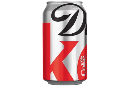 As of Autumn 2011 a new limited addition design for Diet Coke is now available, as apart of their US advertising campaign “Stay Extraordinary”. The new modern look for the aluminium cans sees the focus fall on the products logo, emphasising the D from diet and the K from coke.
The new can design was created by San Francisco-based design agency Turner Duckworth. David Turner, a partner at Turner Duckworth had this to say about the design.
Subscribe to:
Posts (Atom)