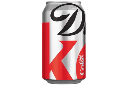
Diet Coke
Looking at the current logo for Diet Coke (adopted in 2007), one thing comes across and that is sex. It is sexy the typeface sells it all on its own but add to that the silver can, the swirly background image and the product just sells on image alone. Compared to how the logo used to look, it now more than ever targets the female population with its sleek and simple design.
Of course diet coke isn't primarily targeted at a female audience, as a sugar free alternative to Coca Cola it appeals to the people who are concerned with calorie counting and to diabetics who can't afford to risk drinking Coca Cola but still wish to enjoy the same great taste.
 |
| A Diet Coke can from 1994 compared to one from 2009. |
Stay Extraordinary, Diet Coke’s current US advertising campaign as of 2010.
In the 1:02 min advert Stay we view both men and woman from all walks of life enjoying a diet coke. The ad caters to the masses starting with the plain folk angle it moves between that and the snob appeal without taking away the emotional selling point of “this drink is for you and everyone you know and don’t know”.
I feel that for that reason alone it works, Coke can and has and will make those adverts with the celebrities in and I don’t know if they sell better or worse but I know in this advert everyone is given the ability to identify. Diet Coke is more of a female brand but were woman the only ones featured in this ad?
Diet Coke Brings Extraordinary New Style to the Soft Drink Aisle |
 As of Autumn 2011 a new limited addition design for Diet Coke is now available, as apart of their US advertising campaign “Stay Extraordinary”. The new modern look for the aluminium cans sees the focus fall on the products logo, emphasising the D from diet and the K from coke.
The new can design was created by San Francisco-based design agency Turner Duckworth. David Turner, a partner at Turner Duckworth had this to say about the design.


No comments:
Post a Comment